
Researches: References’s analyse
Here I will list and analyse the direct and indirect influences I
used in my work.
This will
help me to define the objectives and the tools of my communication.
My central
message is very simple: "the erasmus experience is funny, let’s do it."
I use a
friendly tone, different from the brochures, and talk about my personnal
experience to make it human, and then, attractive.
I also want to make it very fresh, especially because it is adressed to young poeple (students).
I also want to make it very fresh, especially because it is adressed to young poeple (students).
11) Studio Pomp
The publications of Studio Pomp, a dutch
collective, is probably what is the most close to my work. It was one of my
first references and I came back to it many times.
- It is a collection of tips, so it is the same
type of content than my book.
- The tone is friendly and humoristic.
- The layout and the typography occupes a major
place in the communication and really works efficiently with the content.


–> I use this type of organised layout often. It is also comparable to Delphine Mach's work. (See below)


My first layouts and my concept were strongly influenced by these.


–> This page gave me the idea for this, by example:


22) Delphine Mach
Delphine Mach is an french illustrator. Her work influenced me since the
beginning.
-
Her
naive style is very efficient to communicate simple messages with sensibility and freshness.
-
She
have a interesting sense of layout and composition. She have a very methodic way to organise space and place narrative elements in it. It makes pleasant to read.
-
It
is full of humor.


Here are some of my sketches wich were influenced by her work:


34) Lewis Trondheim
Lewis Trondheim is a french cartoonist. I’m especially interested in his autobiographic travel comic books.
-
He
draw in a very minimalist and efficient style, especially in the attitude and the expression of his characters; and often doesn’t use pannels.
-
He
got a very personnal humor when he tells stories. He point absurd things
without comment them, and tells about the little details.


–> It inspired me the way I draw my personal experience in my sketchbooks


55) The japanese mascots
There
is one other thing that appear often through my work: little mascots.
They are one of the pillars of my communication: cute characters, a bit unpersonnal, that makes the text friendly.
It is not something concious, I do it naturally.
I
think this habit cames to me after my trip in Japan, where they are omnipresent,
in front of shops, on universities brochures… and always in a
specific naive manga style, wich had an influence on me.


56) The importance of layout in the
relation text-image
One important thing is the layout: I have to compromise
between rich, attractive illustrations on the one side; and make them communicative and clear on the other
side.
Here are some examples I consulted:


77) The fun in the communication
My communication strategy is to design a funny object
to communicate informative content. The humor is then primordial. It is a very basic principle wich is very often used, especially in
advertising.
By exemple, the advertising creatifs 1kilo3 decided to favour humanity, humor and quality in
their campaigns.
On the internet also, a lot of website attract poeple to the information and the content by a funny, friendly tone.
Here are some website I visited get some inspiration:
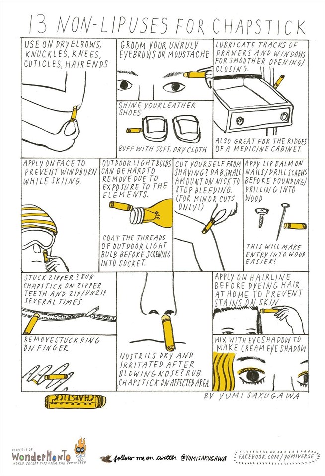
- http://thesecretyumiverse.wonderhowto.com/ give surprising tips in comics.
-Moneysupermarket, a website of banking and insurance, calculated "how much it cost to be ironman "
http://www.moneysupermarket.com/money/the-cost-of-being-iron-man-infographic.aspx


- http://thesecretyumiverse.wonderhowto.com/ give surprising tips in comics.
-Moneysupermarket, a website of banking and insurance, calculated "how much it cost to be ironman "
http://www.moneysupermarket.com/money/the-cost-of-being-iron-man-infographic.aspx
They use a funny communication for a content that may be daunting, as I did with the little monsters to talk about the administration.


- http://www.philosophybro.com/ explain philosophy, but in the "bro" language. It makes the information accessible by making it funny and original. The tone is the important thing. It is like if a friend was talking. That is the tone I try to obtain in my book, by example when I say "have a cupcake" or "burn convinient food".


Aucun commentaire:
Enregistrer un commentaire