It is the most difficult part to illustrate because it is a bit boring and not really visual.
Also, because the rest of the book contains so many big illustrations, I think it may be good to have some pages with more text and less images, more "quiet".
But I don't want to have all the text in the beginning and all the images after neither. So it is a lot of compromises that I have to find.
And I am not happy yet with these. But, well, that is where I am at the moment.
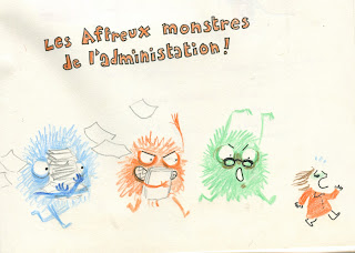
I also made this illustration, wich I could include somewhere.
It says "the terrible monsters of administration".
Maybe I could work my layout pages with a monster corresponding to each document.
Something like this, maybe:


Aucun commentaire:
Enregistrer un commentaire